TextField
Displays a single-line text field for string input.
| Key | Type | Description | Required | Default | Min Version |
|---|---|---|---|---|---|
| alignment | string | Text alignment | – | Left | – |
| keyboard | string | Keyboard type | – | Default | – |
| placeholder | string | Placeholder text | Localizable | "" | – |
| isSecure | boolean | Mask characters with dots | – | false | – |
| clearButtonMode | string | Show clear button | – | Never | – |
| maxLength | integer | Max text length | – | INT_MAX | – |
| validationRegex | string | Regex used to validate input | – | nil | 1.2-10 |
| prompt | string | Prompt title | Localizable | nil | 1.2-10 |
| message | string | Prompt message | Localizable | nil | 1.2-10 |
| okTitle | string | Prompt confirm button title | Localizable | "OK" | 1.2-10 |
| cancelTitle | string | Prompt cancel button title | Localizable | "Cancel" | 1.2-10 |
This component does not support icon. If label is set, it is recommended to set alignment to "Right".
If the input fails to match validationRegex, it cannot be saved.
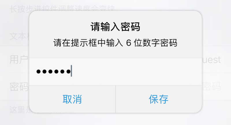
If either prompt or message is non-empty, tapping the TextField will show a prompt dialog requesting input there.
| alignment | Description |
|---|---|
| Left | Left |
| Center | Center |
| Right | Right |
| Natural | Natural |
| Justified | Justified |
| keyboard | Description |
|---|---|
| Default | System and third-party keyboards |
| Alphabet | ASCII |
| ASCIICapable | ASCII |
| NumbersAndPunctuation | Numbers and punctuation |
| URL | URL |
| NumberPad | Number pad |
| PhonePad | Phone pad |
| NamePhonePad | Name and phone |
| EmailAddress | Email address |
| DecimalPad | Number with decimal point |
| clearButtonMode | Description |
|---|---|
| Never | Never |
| Always | Always |
| WhileEditing | While editing |
| UnlessEditing | Unless editing |
| Return Type | Description |
|---|---|
| string | Text field value |
Theme
| Theme Key | Type | Description |
|---|---|---|
| textColor | Color | Text color |
| caretColor | Color | Caret color |
| placeholderColor | Color | Placeholder color |
Example
{
default = "";
label = "Username";
cell = "TextField";
key = "username";
keyboard = "Default";
alignment = "Right";
placeholder = "Enter username";
maxLength = 21;
validationRegex = "^[0-9a-zA-Z]+$";
};
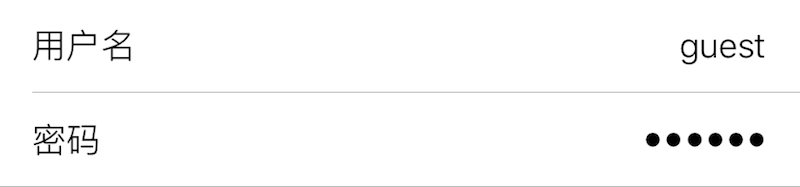
{
isSecure = true;
default = "";
label = "Password";
cell = "TextField";
key = "password";
keyboard = "NumberPad";
alignment = "Right";
placeholder = "Enter password";
prompt = "Enter password";
message = "Please input a 6-digit numeric password";
validationRegex = "^[0-9]{6}$";
okTitle = "Save";
cancelTitle = "Cancel";
};