Group
Displays a grouped section containing all components until the next Group. It is commonly used to separate features or add supporting descriptions. The first item in the list should usually be a Group; otherwise, XUI automatically inserts one at the top.
| Key | Type | Description | Required | Default | Min Version |
|---|---|---|---|---|---|
| label | string | Group title | Localizable | "" | – |
| footerText | string | Small text after this group | Localizable | "" | – |
This component does not support icon/height.
Theme
| Theme Key | Type | Description |
|---|---|---|
| groupHeaderTextColor | Color | Header title color (label) |
| groupFooterTextColor | Color | Footer text color (footerText) |
| groupHeaderBackgroundColor | Color | Header background color |
| groupFooterBackgroundColor | Color | Footer background color |
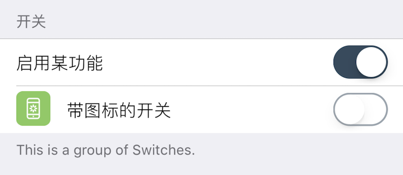
Example
-- Group
{
    cell = "Group";
    label = "Switches";
    footerText = "This is a group of switches";
};
-- The next two components are switches in this group
{
    default = true;
    label = "Enable feature";
    cell = "Switch";
    key = "enabled";
};
{
    default = false;
    label = "Switch with icon";
    cell = "Switch";
    key = "enabled1";
    icon = "res/16.png";
    readonly = true;
};
-- Another group
{
    cell = "Group";
    label = "Another Group";
};
-- ...