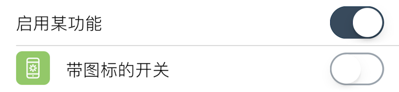
Switch
Displays a toggle switch.
| Key | Type | Description | Required | Default | Min Version |
|---|---|---|---|---|---|
| negate | boolean | Invert the displayed state | – | false | – |
| trueValue | primitive | Value to save when switch is true (defaults to true) | – | true | – |
| falseValue | primitive | Value to save when switch is false (defaults to false) | – | false | – |
| Return Type | Description |
|---|---|
| primitive | Matches the switch state; if negate is true, the saved value is inverted. If set, trueValue/falseValue override the saved value. |
Theme
| Theme Key | Type | Description |
|---|---|---|
| offTintColor | Color | Track color when off |
| onTintColor | Color | Track color when on |
| thumbTintColor | Color | Thumb color |
Example
{
    default = true;
    label = "Enable feature";
    cell = "Switch";
    key = "enabled";
};
{
    default = false;
    label = "Switch with icon";
    cell = "Switch";
    key = "enabled1";
    icon = "res/16.png";
    readonly = true;
};