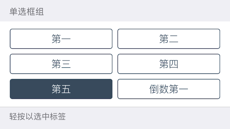
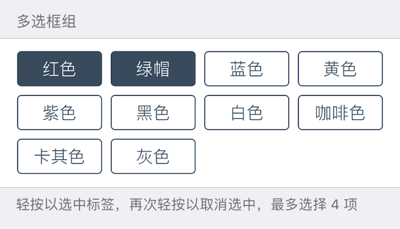
Radio / Checkbox
Displays radio buttons or checkboxes.
Tapping a radio button selects it and deselects others in the same group. Tapping a checkbox toggles its selection state.
| Key | Type | Description | Required | Default | Min Version | Notes |
|---|---|---|---|---|---|---|
| options | array of dictionaries | Options list | * | – | – | – |
| numPerLine | integer | Items per line | – | 2 on iPhone, 4 on iPad | 1.2-10 | Max 12 |
| minCount | integer | Minimum selected items | – | 0 | – | Checkbox only |
| maxCount | integer | Maximum selected items | – | INT_MAX | – | Checkbox only |
Each option dictionary has:
| Key | Type | Description | Condition |
|---|---|---|---|
| title | string | Option title | Localizable |
| value | primitive | Saved value; defaults to title if omitted | Optional |
This component does not support label/icon/height. Use Group to add titles/descriptions.
| Return Type | Description |
|---|---|
| array of primitive | Array of selected option values |
Theme
| Theme Key | Type | Description |
|---|---|---|
| tagTextColor | Color | Tag text color |
| tagSelectedTextColor | Color | Selected tag text color |
| tagBackgroundColor | Color | Tag background color |
| tagSelectedBackgroundColor | Color | Selected tag background color |
| tagBorderColor | Color | Tag border color |
| tagSelectedBorderColor | Color | Selected tag border color |
Example
{
    cell = "Group";
    label = "Checkbox Group";
    footerText = "Tap to select; tap again to deselect; up to 4 items";
};
{
    default = { "Red"; "Green"; };
    cell = "Checkbox";
    key = "checkbox";
    maxCount = 4;
    numPerLine = 4;
    options = {
        { title = "Red"; };
        { title = "Green"; };
        { title = "Blue"; };
        { title = "Yellow"; };
        "Purple";
        "Black";
        "White";
        "Brown";
        "Khaki";
        "Gray";
    };
};
{
    cell = "Group";
    label = "Radio Group";
    footerText = "Tap to select";
};
{
    default = "Fifth";
    cell = "Radio";
    key = "radio";
    options = {
        { title = "First"; };
        { title = "Second"; };
        { title = "Third"; };
        { title = "Fourth"; };
        { title = "Fifth"; value = "Fifth"; };
        "Last";
    };
};