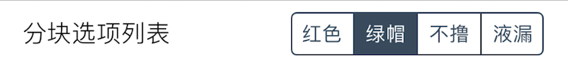
Segment
Displays a segmented control for single selection (generally when the total number of options is fewer than 6).
| Key | Type | Description | Required | Default | Min Version |
|---|---|---|---|---|---|
| options | array of dictionaries | Options list | * | – | – |
Each option dictionary has:
| Key | Type | Description | Condition |
|---|---|---|---|
| title | string | Option title | Localizable |
| value | primitive | Saved value; defaults to title if omitted | Optional |
This component does not support icon.
| Return Type | Description |
|---|---|
| primitive | Selected option value |
Example
{
    default = "Blue";
    label = "Segmented options";
    cell = "Segment";
    key = "list-segment";
    options = {
        { title = "Red"; };
        { title = "Blue"; };
        { title = "Gray"; };
        { title = "Yellow"; };
    };
};