Set a theme dictionary at the root level to configure unified styles for the page. All components and sub-pages inherit every field from the root theme dictionary.
If you need to style a component individually, set a theme dictionary inside that component. Fields inside a component-level theme override the same keys from the root theme during a merge. Different components may have their own theme keys; see each component’s Theme table.
If a component links to a non-XUI sub-page (e.g. Option/MultipleOption/OrderedOption/EditableList), the sub-page uses the component’s theme. If a component links to another XUI sub-page (e.g. Link), the sub-page can set its own theme, which will be merged with its parent page’s theme.
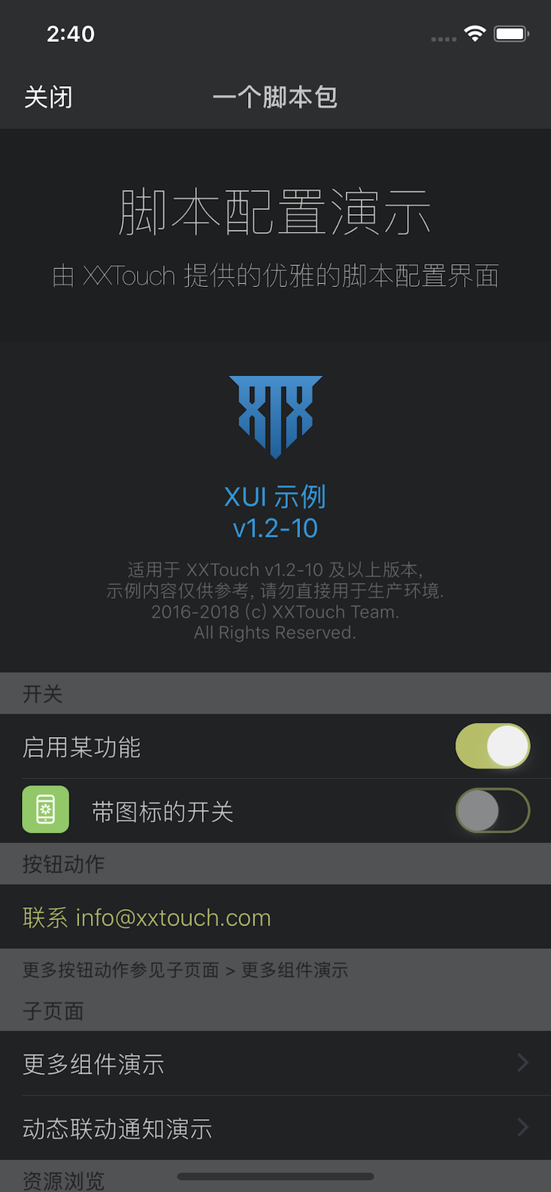
Page
| Key | Type | Description |
|---|
| style | Style | Page style |
| tintColor | Color | Foreground color |
| backgroundColor | Color | Background color |
| separatorColor | Color | Separator color between cells |
| backgroundImage | string | Relative path to background image |
Navigation Bar
| Key | Type | Description |
|---|
| navigationBarColor | Color | Navigation bar background color |
| navigationTitleColor | Color | Navigation title color |
Header & Footer
| Key | Type | Description |
|---|
| headerTextColor | Color | header text color |
| subheaderTextColor | Color | subheader text color |
| footerTextColor | Color | Footer text color |
| headerBackgroundColor | Color | header background color |
| footerBackgroundColor | Color | Footer background color |
Common Cells
| Key | Type | Description |
|---|
| cellBackgroundColor | Color | Cell background color |
| disclosureIndicatorColor | Color | Disclosure indicator color |
| selectedColor | Color | Selected color |
| highlightedColor | Color | Highlighted color |
| labelColor | Color | Title text color |
| valueColor | Color | Value text color |
Status
| Key | Type | Description |
|---|
| dangerColor | Color | Error color |
| warningColor | Color | Warning color |
| successColor | Color | Success color |
Styles
| style | Description |
|---|
| Grouped | Grouped style (default) |
| Plain | Plain list style |
The Color type is a hex RGB/RGBA string beginning with #, e.g. #FF0000 is red.